Government mail service may be affected by the Canada Post labour disruption. Learn about how critical government mail will be handled.
Introduction
Farmers may be tempted to wait for higher prices before making a crop marketing decision. However, waiting can end in disappointment because prices can fall instead of rise, with much of the crop eventually marketed at the lower end of the price range for the year.
Using price frequency charts can be a good decision-making resource for farm marketers. A frequency chart shows how often, or what percentage of the time, a price for a crop has reached a certain level. Price frequencies are a good way to see prices in perspective over time.
Frequency charts
Cash prices are just one consideration when making marketing decisions. Price frequency charts are a tool that can help make marketing decisions by adding a historical perspective.
Below are cash price history and price frequency charts for No. 1 canola, wheat, feed barley, and yellow peas from 2013 through 2022. These charts give a review of how prices moved over a 10-year period and the frequency of price levels. The price rise to historically high levels in recent years results in a higher price average as shown in the horizontal line of the cash price history charts. Those higher prices may skew one’s opinion of what is a high price.
The second chart for each crop shows price frequencies over the period 2013 through 2022. Those price frequency charts provide another valuable perspective of that price history.
Figure 1. Canola prices, Central Alberta 2013 through 2022

Figure 2. Canola price frequencies, Central Alberta, 2013 through 2022
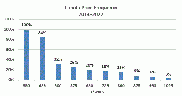
For example, the second bar of the canola price frequency chart shows the percentage of time over 10 years that the price of canola was $425/tonne or more. During the 10-year time period, canola sold for at least $425/tonne ($9.64/bushel) 84% of the time.
The third bar shows that canola sold for at least $500/tonne 32% of the time during the 10 year period. Towards the right side of the chart, a price of $950/tonne or higher was available only 6% of the time during those 10 years.
Cash costs of crop production have risen during this 10-year period and that fact must be considered in marketing decisions. However, the market does not respect the need for producer profit. Therefore, together with other factors of market analysis, producers should consider the frequency of price occurrence at the various levels in making price judgements.
Figure 3. Milling wheat (Hard Red Spring) prices, Central Alberta 2013 through 2022
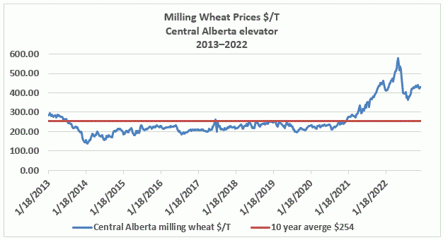
Again, the milling wheat prices have been relatively high lately, and that may skew one’s opinion of a “good” price. Knowing one’s costs of production and being able to calculate a breakeven price per unit of production (for example, $/tonne or $/bushel) based on expected yields forms the base price required to begin making a profit. The historical price frequencies provide perspective to the question of “good” price.
Figure 4. Milling wheat price frequencies – Central Alberta, 2013 through 2022
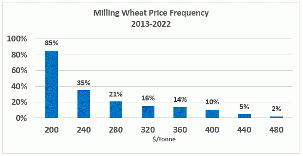
Figure 5. Feed barley prices, Central Alberta 2013 through 2022
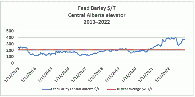
Figure 6. Feed barley price frequencies, Central Alberta, 2013 through 2022

Figure 7. Yellow pea prices, Central Alberta 2013 through 2022

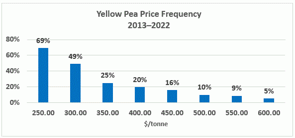
Figure 8. Yellow pea price frequencies 2013 through 2022
