Government mail service may be affected by the Canada Post labour disruption. Learn about how critical government mail will be handled.
Columns grid
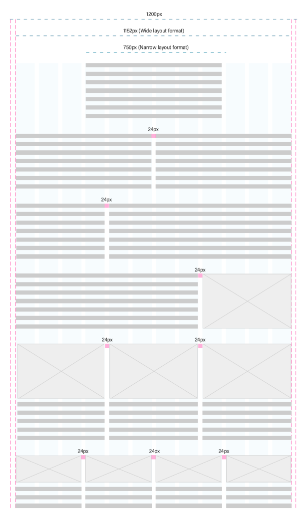
We apply a wide and narrow layout format. In the wide layout format (1200px width), the page contents may employ up to 4 columns and use a margin of 24px.
In the narrow layout format (750px width) the page contents may employ up to 2 columns.
Column width uses percentages, rather than fixed values.
Gutters, or the spaces between columns, use a fixed value (24px).

Responsive
For desktop, tablet and mobile there is a 24px margin.
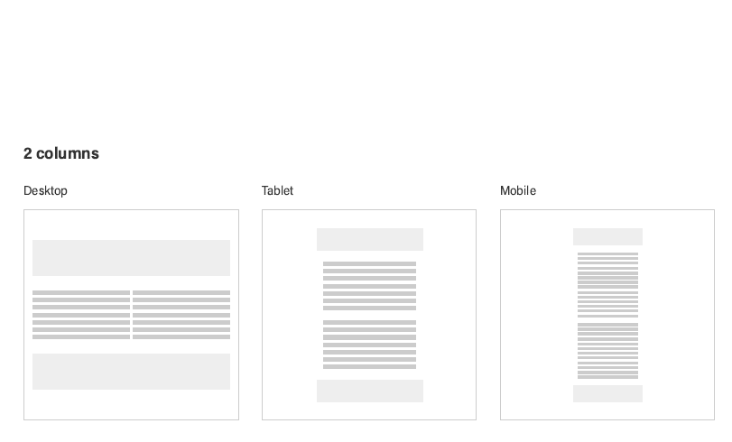
Two columns in desktop will become one column in tablet and mobile.

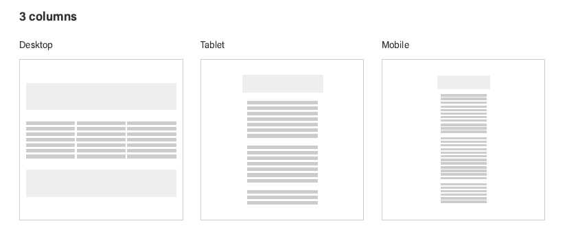
Three columns in desktop will become one column in tablet and mobile.

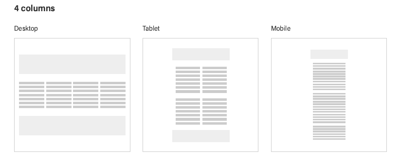
Four columns in desktop will become 2 columns in tablet and one in mobile.

Previous
Clickable objects